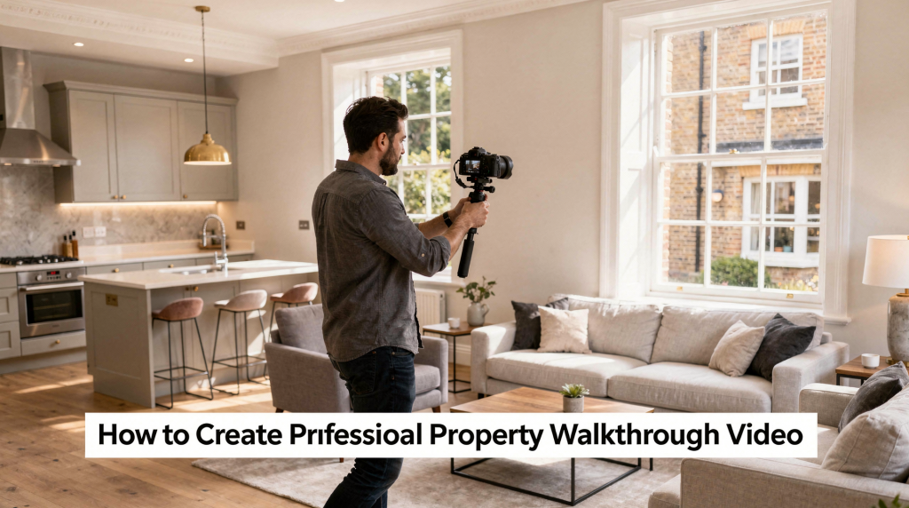
A well-executed property walkthrough video connects the dots that still photos leave scattered. It gives buyers a genuine sense of how spaces relate to each other—the flow from kitchen to dining area, the natural light path through the living room, the privacy of the bedroom wing. That spatial understanding builds confidence and often eliminates the need for a speculative viewing. For agents working the English market, the most effective walkthroughs are never about flashy camera tricks. They’re calm, methodical, and designed to replicate the way a buyer’s eye would travel if they were standing in the home themselves.
Why property walkthrough videos work
Photos sell individual moments. A walkthrough video sells the movement between them. That distinction matters because many buyers don’t struggle to imagine a kitchen or a bedroom on its own—they struggle to understand how the whole home fits together. A floorplan helps, but it’s an abstraction. Video makes the layout tangible.
A good walkthrough video helps you:
- reveal the true spatial logic of the home—something a floorplan hints at but rarely communicates emotionally
- reduce wasted viewings from buyers who would never feel comfortable in the space
- make a listing feel more premium, considered, and trustworthy
- highlight features that stills often miss: flow, natural light paths, usable square footage, and the relationship between rooms
- give agents versatile content that works across portals, websites, email, and social media
For the English market, this is especially valuable in competitive areas where buyers swipe through dozens of listings in minutes. A video that feels polished and easy to follow often creates a stronger first impression than a gallery of stills alone—and it can be the reason someone pauses, watches, and books a viewing.
What makes a property walkthrough video look professional
Professional does not mean flashy. In property video, professionalism usually means the viewer never has to wonder what they are looking at. The moment the camera movement, lighting, or editing draws attention to itself, you’ve lost the property. The best walkthroughs feel almost invisible—they simply guide the eye.
The core qualities to aim for
- Steady camera movement — no sudden bumps, swerves, or unnecessary zooming. A gimbal helps, but the real secret is walking with soft knees and breathing out during moves.
- Logical room order — follow the way a buyer would naturally move through the home. Start with context, then lead them deeper.
- Good lighting — bright, balanced interiors without blown-out windows. Mixed lighting should be controlled so colour temperatures don’t clash.
- Clean framing — show space clearly rather than cutting off key features. Wide but not distorted; every frame should answer “what room is this and how big does it feel?”
- Simple editing — smooth cuts, minimal transitions, no distracting effects. If you’re tempted to add a star wipe, step away from the timeline.
- Clear purpose — the video should suit the property, audience, and marketing channel. A walkthrough for Rightmove needs different pacing than one for Instagram Reels.
A polished walkthrough is calm and intentional. If the viewer notices the filming style more than the property, the video has gone too far.
Plan the walkthrough before you film
The biggest difference between average and strong property video is planning. Walking in and “seeing what happens” almost always leads to awkward pacing, missed details, and repetitive shots. Worse, it creates hours of extra editing as you try to salvage a coherent sequence from random clips. A 20‑minute walkthrough with a clear plan will save you an afternoon in post‑production.
Pre-filming checklist
- Confirm the goal of the video: portal listing, social media, premium launch, or full virtual‑style tour. This decision shapes length, style, and whether you need voiceover.
- Walk the route in advance and decide the order of rooms. Do a test pass with your camera to check light and framing.
- Check which features matter most for this specific property—perhaps it’s the kitchen‑diner flow, the master suite, or the garden aspect.
- Make sure access is arranged for every room, outbuilding, and outdoor area. Nothing kills momentum like a locked door mid‑shoot.
- Confirm whether the video will include voiceover, on‑camera intro, or music only. This affects how you shoot transitions and pauses.
- Decide the final length before filming begins. Knowing your target duration keeps you disciplined about what to include and what to leave out.
Room sequence that usually works well
This order does not suit every property, but it is a reliable starting point. If the façade is uninspiring, consider opening on a strong interior “wow” shot, then cutting back to the exterior for context. The key is to give the viewer a sense of arrival and progression.
| Order | What to show | Why it matters |
|---|---|---|
| 1 | Exterior or street approach | Sets context and creates a first impression; establishes kerb appeal |
| 2 | Entrance / hallway | Establishes the transition into the property and hints at the home’s character |
| 3 | Main reception space | Shows scale and the first key living area—often the emotional heart of the home |
| 4 | Kitchen / dining area | Often a major decision point for buyers; demonstrates practicality and social flow |
| 5 | Bedrooms | Helps viewers understand private spaces, natural light, and layout relative to living areas |
| 6 | Bathrooms | Important for practicality and finish; a clean, well‑lit bathroom signals good maintenance |
| 7 | Garden / balcony / terrace | Shows outdoor usability and extends the sense of space |
| 8 | Final exterior shot | Gives the video a clean ending and leaves a lasting impression of the whole property |
How to prepare the property
The camera will reveal small issues that are easy to ignore in person. A stray cable, a cluttered countertop, or a fingerprint on a mirror can pull focus and make the home feel less cared for. Preparation isn’t about staging a show home—it’s about removing distractions so the architecture and space can speak.
Before filming, make sure the property is:
- tidy and uncluttered—surfaces clear, worktops almost bare, no piles of post or paperwork
- well lit with curtains and blinds open where appropriate; use daylight as your main source and supplement with artificial light in dark corners
- free from obvious personal items—family photos, fridge magnets, children’s artwork all pull the viewer out of the “imagining myself here” mindset
- cleaned, especially reflective surfaces and bathrooms; mirrors, taps, and glass should be streak‑free
- visually balanced, with chairs, cushions, and table items arranged neatly to create a sense of order
- ready for doors to be open where needed for flow—open doorways add depth and invite the camera through
Small details that improve the result
- Turn on lights to add warmth and reduce dark corners, but switch off any bulbs that cast a cold, clinical hue
- Hide bins, cables, cleaning products, and pet items—these instantly cheapen the shot
- Straighten rugs, towels, bedding, and cushions; slight crookedness reads as carelessness on screen
- Close toilet lids—a tiny detail that subconsciously signals a well‑maintained home
- Wipe down mirrors, taps, and worktops; even small water spots catch the light and look like smudges
- Remove anything that distracts from the room’s shape or size—excess furniture, oversized plants, or busy patterns
For English homes, especially compact flats and terraces, clutter has an outsized effect. A clean room reads as larger, brighter, and more desirable. In a small space, every item you remove adds square footage in the viewer’s mind.
Choosing the right filming style
There is no single correct style for every listing. The right approach depends on the property type, the target audience, and where the video will live. A young couple scrolling Instagram expects a different energy than a family browsing Rightmove on a Sunday evening. Understanding that context helps you pick a format that feels native to the platform and the buyer’s mindset.
Common walkthrough formats
| Format | Best for | Strengths | Limitations |
|---|---|---|---|
| Silent walkthrough with music | Portals and social clips | Clean, simple, widely usable; no need for on‑site audio recording; easy to adapt for different platforms | Less explanation of features; relies entirely on visuals to tell the story |
| Narrated walkthrough | Premium listings and developer launches | Adds context and personality; can highlight upgrades, dimensions, and local amenities | Requires strong audio and a tight script; a poor voiceover can ruin an otherwise good video |
| Agent‑presented intro | Branding and lead generation | Builds trust and familiarity; puts a face to the agency | Can feel too promotional if overdone; risks dating the video if the agent leaves |
| Hybrid tour | Most versatile option | Combines clarity with explanation; uses text overlays for key details while keeping the visual flow | Needs careful editing to balance elements without clutter |
If the property has unusual features—a converted loft, a split‑level layout, a standout garden room—a narrated or hybrid approach can help. If the home is broad‑appeal and the visuals carry the message, a silent version may be better. When in doubt, the hybrid model gives you the best of both worlds.
Camera movement: keep it smooth and human
The camera should mimic how a person naturally looks around a room. That usually means slow, steady movement with pauses that let the viewer take things in. Think of it as walking a friend through the home—you wouldn’t sprint from room to room, and you’d pause at doorways to let them appreciate the space.
Practical movement rules
- Move slowly through the property—at a pace that lets the viewer absorb details, not just register walls.
- Keep the camera at a natural eye‑line where possible (around 1.5–1.6 metres). Shooting too low makes ceilings feel oppressive; too high disconnects the viewer from the human perspective.
- Avoid fast pans across the room. A slow, controlled pan works; a whip pan makes viewers dizzy.
- Pause briefly at doorways and room entrances. A 2–3 second hold gives the brain time to process the new space before you enter.
- Keep turns gentle and predictable. Sudden direction changes break the illusion of a natural walk.
- Use the same movement style throughout the video. Consistency builds a calm, professional rhythm.
A stabiliser or gimbal helps, but equipment alone does not create professionalism. The operator still needs to move carefully and avoid over‑correcting. I’ve seen plenty of gimbal footage that looks robotic because the operator fought the stabiliser instead of flowing with it.
Common movement mistakes
- walking too quickly—the property becomes a blur, and the viewer feels rushed
- swinging the camera left and right as if searching for something—this screams “unplanned”
- filming from too low or too high—distorts proportions and makes rooms feel unnatural
- making rooms feel smaller with tight, jerky framing—if you can’t see the full width of a room, you can’t judge its size
- overusing close‑ups that destroy the sense of space—details matter, but not at the expense of context
If the viewer feels dizzy, the property loses credibility. A smooth, deliberate walkthrough, on the other hand, makes even a modest home feel considered and inviting.
Lighting tips that make a big difference
Light is one of the easiest ways to improve a walkthrough video. In most cases, natural daylight is the best starting point, but it needs to be controlled. The goal is not to make the property look artificially perfect—it’s to make it look clear, inviting, and true to life. Overlit rooms feel sterile; underlit rooms feel gloomy. The sweet spot is balanced, soft illumination.
Use light effectively
- Film during the brighter part of the day when possible, but avoid the harsh midday sun if it creates strong shadows.
- Open curtains and blinds to bring in daylight—natural light makes spaces feel larger and more welcoming.
- Turn on interior lights for warmth and balance, especially in hallways and corners that daylight doesn’t reach.
- Avoid harsh sunlight that blows out windows or creates deep, distracting shadows. If necessary, diffuse with net curtains or shoot at a different time.
- Check that mixed lighting does not give rooms a strange colour cast. A warm lamp next to a cool window can produce an unflattering orange‑blue mix. Set your white balance manually or correct in post.
In typical English weather, you’ll often deal with overcast skies. That soft, even light can be a blessing—it wraps around rooms without harsh contrast. On those days, just add a little artificial light to lift the shadows and give the image some depth.
A useful rule of thumb
If a room looks great in person but dull on camera, increase light. If a room looks bright in the camera but the windows are washed out, reduce the direct light entering the frame. Sometimes simply changing your shooting angle so the window isn’t in shot solves the problem instantly.
How long should a property walkthrough video be?
Length should serve the property, not the other way around. A small flat usually needs less screen time than a large detached home or premium development. But don’t confuse short with rushed—a 60‑second video that feels hurried is worse than a 90‑second one that breathes. Every extra second should show something useful.
General length guide
| Property type | Typical length |
|---|---|
| Studio / one‑bed flat | 45–90 seconds |
| Standard two‑ to three‑bed home | 1–2.5 minutes |
| Larger family home | 2–4 minutes |
| Premium or feature‑rich property | 3–6 minutes |
Shorter is not automatically better. A rushed video can feel unhelpful. But long videos also need discipline. For social media, aim for the lower end of these ranges; for portals, you can stretch a little if the content justifies it. Always ask: “Does this clip add value, or am I just filling time?”
Should you add voiceover, text, or music?
This depends on the audience and channel. A video watched silently on a mobile screen needs different support than one viewed on a desktop with headphones. The most common mistake is treating these elements as afterthoughts rather than integral parts of the storytelling.
Voiceover
Use voiceover when you need to explain practical selling points that aren’t obvious visually: room sizes, recent upgrades, appliance brands, transport links, or layout quirks. Keep the script concise and conversational—a walkthrough is not a speech. Record in a quiet space with a decent microphone; bad audio will undo good footage faster than anything else.
Text overlays
Text can help when the video will be viewed silently on social platforms—which is most of the time. Useful overlays include room names, key features, asking price, tenure or key specification details, and a call to action. Keep the font clean and large enough to read on a phone screen. Don’t overcrowd the frame; two or three words per overlay are usually enough.
Music
Music is useful when kept subtle. It should support the video, not compete with it. Avoid tracks that feel too dramatic, fast, or cheesy for the property type. Choose royalty‑free or licensed music to avoid copyright strikes. Match the tempo to the pace of your camera movement—a slow, elegant home needs a gentle track; a modern city flat can carry something a little more upbeat. And always set the music level low enough that it doesn’t drown out voiceover or ambient sounds if you keep them.
Editing: where good footage becomes a good video
Even well‑shot footage can feel amateur if the edit is messy. Editing should improve clarity, not call attention to itself. The best edits are the ones viewers never notice—they just feel the flow.
Editing checklist
- Trim dead time at the start and end of each clip—those moments where the camera is still or you’re adjusting position add nothing.
- Arrange rooms in a logical viewing order, even if you shot them in a different sequence. The edit is where you build the narrative.
- Keep transitions simple—a straight cut is almost always the right choice. Avoid wipes, dissolves, and fancy effects that date the video and distract from the property.
- Remove shaky or poorly exposed shots, even if they show a key feature. If it’s essential, reshoot; if not, cut it.
- Match pacing to the style of the property. A spacious country house can breathe; a compact city flat benefits from slightly tighter editing, but never rushed.
- Add branding in a restrained way—a small logo bug in the corner and contact details at the end are sufficient. The property is the star, not your agency.
- Include a clear call to action at the end: “Book a viewing,” “Call us,” “See the full listing.” Don’t leave the viewer hanging.
Keep branding subtle
Your logo, contact details, or agency colours should support the listing rather than overpower it. Buyers are there to evaluate the home, not watch a brand reel. I’ve seen otherwise beautiful walkthroughs ruined by a giant animated logo that screams “marketing.” Let the property do the selling; your branding just needs to be there when the viewer is ready to act.
A simple walkthrough video workflow
If you want a repeatable process that delivers consistent results, use this workflow. It turns a potentially chaotic shoot into a calm, predictable system.
Step-by-step process
- Decide the purpose of the video—platform, audience, and desired action.
- Prepare the property and clear distractions. Walk through with the agent or owner to catch anything you might miss.
- Plan the route through the home. Do a dry run with the camera to check light and composition.
- Film the exterior and entrance first. This establishes context and gives you a natural starting point.
- Move through the interior in a natural order, pausing at doorways and key features.
- Capture important features and transitions—staircases, sight lines, and any details that tell the home’s story.
- Record voiceover separately if needed, in a controlled environment with a good microphone.
- Edit with clean pacing and simple branding. Cut anything that doesn’t serve the narrative.
- Export in the right format for each platform—horizontal for portals, possibly a vertical crop for Stories.
- Review the final video on mobile before publishing. Most property videos are watched on phones, where weak framing or tiny text becomes obvious very quickly.
That last step matters enormously. A video that looks great on a 27‑inch monitor can feel cramped and illegible on a 6‑inch screen. Always test where your audience will actually watch.
Platform-specific thinking for English estate agents
A single walkthrough video can be repurposed in several ways, but not every version should be identical. Each platform has its own viewing behaviour, and your edit should respect that.
For property portals
- Keep it clear and concise—viewers are in research mode and want information quickly.
- Focus on layout and room flow; they’re comparing multiple properties, so make yours easy to understand.
- Avoid over‑branding—Rightmove and Zoopla have their own UI, and too much agency branding feels pushy.
- Use a format that loads well and feels professional. Most portals autoplay without sound, so visuals must work silently.
For Instagram and Facebook
- Create a shorter cut—60 seconds or less often performs best in‑feed.
- Use text overlays for key details because the majority watch without sound.
- Make the first few seconds visually strong. Open with your best shot to stop the scroll.
- Keep the pace slightly tighter than a portal version. Social audiences have shorter attention spans.
- Consider a vertical or square crop for Stories and Reels, but if the property demands a wide perspective, keep it horizontal and add a “watch in full screen” prompt.
For websites and email campaigns
- Use a fuller version if the property deserves it—here you have a captive audience that has already shown interest.
- Add more context or feature highlights; you can afford a slightly longer runtime.
- Link the video to the full listing and enquiry path. Make it easy to go from watching to booking a viewing.
Typical mistakes to avoid
These are the issues that most often weaken property walkthroughs. I see them repeatedly, even in videos from experienced agents who rush the process.
- Filming without a route plan — leads to chaotic movement, repeated shots, and a confusing viewer experience.
- Using shaky handheld footage — instantly signals amateur production and makes the property feel unsteady.
- Starting with a messy or confusing shot — the first three seconds set the tone; a dark, cluttered opening loses viewers immediately.
- Moving too fast through rooms — doesn’t give the eye time to settle and suggests you’re hiding something.
- Ignoring lighting problems — poor light makes even a high‑end interior look cheap. Always check exposure before rolling.
- Over‑editing with unnecessary effects — star wipes, colour filters, and flashy transitions distract and date the video.
- Showing every room in the same flat, repetitive way — vary your angles and pacing; monotony kills engagement.
- Adding too much narration — when every second is filled with talking, the viewer can’t absorb the visuals. Let the home breathe.
- Forgetting a clear ending or call to action — a video that just stops leaves the viewer unsure what to do next.
- Uploading a version that is too long for the audience — a 5‑minute video on Instagram will lose 80% of viewers after 30 seconds. Tailor length to platform.
The most common mistake is trying to make the video “cinematic” when the real job is informative and persuasive. Save the drone shots and slow‑motion for the sizzle reel; a walkthrough should feel helpful, not like a movie trailer.
Quick quality check before publishing
Use this final checklist before the video goes live. It takes two minutes and catches the issues that erode trust.
Property walkthrough video checklist
- Does the video show the property in a logical order that matches how a buyer would explore?
- Is the camera movement smooth and easy to watch, without jerks or dizzying pans?
- Are the rooms bright and clearly framed, with no blown‑out windows or murky corners?
- Does the edit remove dead time and distractions, keeping only what serves the story?
- Is the length suitable for the property type and the platform where it will live?
- Does the branding feel polished but unobtrusive—present without shouting?
- Can a buyer understand the layout without confusion, even on a small screen?
- Is the call to action clear at the end, telling the viewer exactly what to do next?
If the answer is yes to most of these, the video is ready to publish.
FAQ
What is the best camera for a property walkthrough video?
A good smartphone can produce strong results if the footage is steady and well lit. Modern phones with optical stabilisation and manual exposure controls are surprisingly capable. However, for regular commercial work, a mirrorless or DSLR camera with a wide‑angle lens (16–35mm full‑frame equivalent) and strong dynamic range gives you more flexibility in post and handles high‑contrast scenes better. Technique matters more than expensive gear—but if you’re shooting weekly, a dedicated camera quickly pays for itself in consistency and quality.
Do I need a gimbal for property video?
A gimbal is not mandatory, but it makes smooth movement much easier, especially when walking through doorways and turning corners. If you shoot walkthroughs regularly, it’s a worthwhile investment that will noticeably lift your production value. That said, a gimbal won’t fix jerky footsteps or poor posture—you still need to move with soft, deliberate steps. Practise walking with the gimbal before the shoot so the motion feels natural, not robotic.
Should every listing have a walkthrough video?
Not every listing needs the same level of production, but most homes benefit from some form of video. The more competitive or visually distinctive the property, the more valuable walkthrough video becomes. For a standard two‑bed terrace in a fast‑moving market, even a simple 60‑second phone walkthrough can set the listing apart. For premium or unique homes, a more polished video is almost expected. Assess the return on effort: if video helps you secure a viewing or a quicker sale, it’s worth it.
How do I make a small property look better on video?
Use wide but realistic framing—don’t distort the space with an ultra‑wide lens that makes walls bow. Remove clutter ruthlessly; every item you take out adds visual square footage. Maximise light by opening all curtains and adding lamps in dark corners. Keep the movement slow and steady; rushing through a small space makes it feel cramped. Shoot from corners to show depth, and avoid cutting off the edges of rooms. Small spaces usually suffer when filmed too quickly or too tightly, so give each area room to breathe on screen.
Is narration better than music-only video?
Neither is always better. Narration helps when details matter—room dimensions, recent renovations, or local context that isn’t obvious visually. Music‑only is cleaner and more flexible for social use, where most viewers watch without sound. The best choice depends on the property and the platform. A hybrid approach—using text overlays for key facts over a music bed—often gives you the best of both worlds. If you do use voiceover, invest in a decent microphone and keep the script tight; a rambling narration can undo an otherwise strong video.
Final thoughts
A professional property walkthrough video is not about showing everything as quickly as possible. It’s about guiding the viewer through the home in a way that feels natural, clear, and trustworthy. When the route is planned, the property is prepared properly, and the edit stays simple, the result does more than display rooms—it helps buyers understand the home and imagine themselves in it. That emotional connection is what turns a casual browser into an enquiry.
For estate agents and property marketers in England, that is the real value of walkthrough video: better presentation, stronger engagement, and a more convincing listing from the very first view. It’s not about having the fanciest gear; it’s about respecting the buyer’s need to feel the space before they ever step inside.