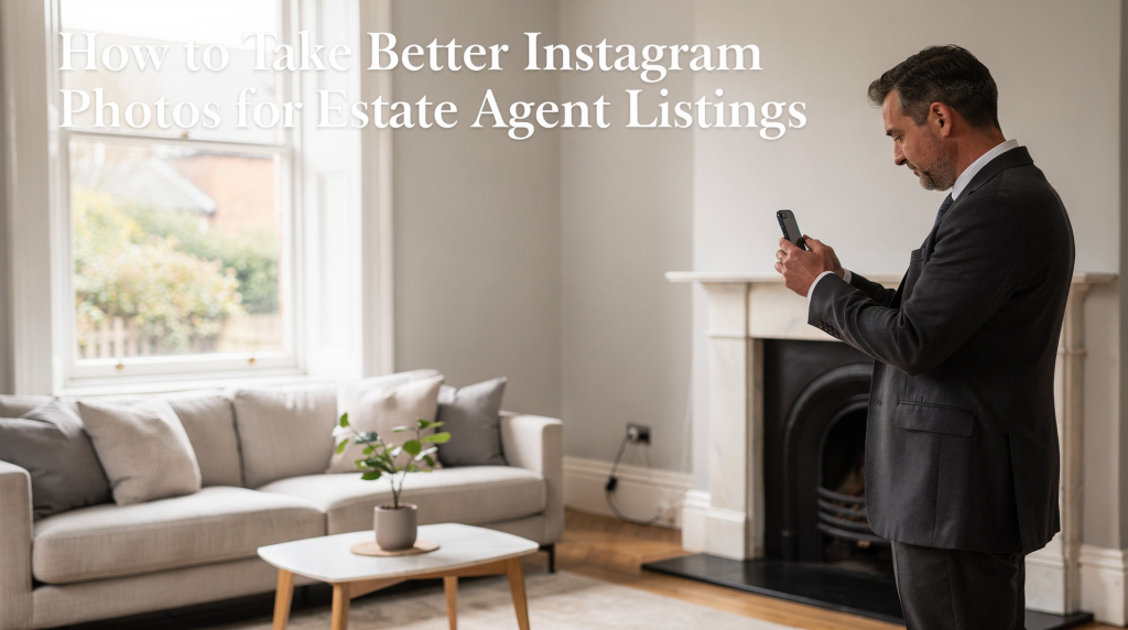
Instagram can be a powerful place to make a property feel memorable before a buyer ever books a viewing. For estate agent listings in England, the goal is not just to post attractive photos — it is to present the home clearly, honestly, and in a way that stops the scroll.
If your listing photos look dark, cramped, or inconsistent, people assume the property is the same. The good news is that a better result does not require expensive gear or a full production team. With the right approach to light, composition, editing, and formatting, you can make every listing look sharper and more persuasive.
Why Instagram photos matter for estate agents
Instagram is a first-impression platform. Buyers often see a property there before they see it on Rightmove, Zoopla, or your website, and that early visual impression affects whether they click through or keep scrolling.
For estate agent listings, strong Instagram photos do three jobs at once:
- They make the property feel more desirable.
- They help buyers understand the space quickly.
- They make your brand look more professional and consistent.
That matters even more in competitive English markets where many homes look similar at first glance. Better visuals help your listing stand out without overpromising.
What makes a good listing photo on Instagram
A good Instagram property photo is clear, bright, balanced, and easy to read on a phone screen. It should show the room honestly while still making it look inviting.
The most effective property photos usually have these qualities:
- Natural-looking light
- Straight vertical lines
- Minimal clutter
- A strong focal point
- Enough context to show room size
- A composition that feels calm, not crowded
For estate agency content, “pretty” is not enough. The image needs to communicate layout, condition, scale, and atmosphere in one glance.
Shoot for the platform, not just the camera
Instagram is a vertical-first platform, and feed posts perform best when they use taller formats rather than cramped square crops. Current image guidance for Instagram feed posts supports square, portrait, and landscape uploads, but portrait formats such as 1080 × 1350 pixels are the safest default for visibility on mobile.
That means you should think about framing before pressing the shutter.
Best Instagram photo sizes for property posts
| Format | Recommended size | Best use | Why it works |
|---|---|---|---|
| Portrait | 1080 × 1350 px | Main listing photos, hero shots | Takes up more screen space and suits mobile browsing |
| Square | 1080 × 1080 px | Grid consistency, simple single-image posts | Safe and familiar, but less immersive on mobile |
| Landscape | 1080 × 566 px | Wide living rooms, views, exterior wides | Useful for cinematic scenes, but visually smaller in-feed |
If you want one reliable format for estate agent Instagram posts, portrait is usually the best starting point.
Step-by-step: how to take better Instagram photos for listings
1. Start with prep, not the camera
The best photos begin before shooting. A room that is half-prepared will always look weaker than one that has been properly set up.
Focus on these basics:
- Remove bins, cables, cleaning products, and loose personal items.
- Open curtains and blinds fully.
- Turn on all practical lights to reduce dark corners.
- Straighten cushions, rugs, and chairs.
- Clear kitchen counters as much as possible.
- Add small, tasteful touches only where they help the image.
In English properties, especially older terraces and flats, clutter and mixed lighting are two of the quickest ways to make a room feel smaller and less premium.
2. Use natural light, but control it
Natural light usually makes interiors feel more spacious and welcoming. Shoot when daylight is available, but avoid harsh midday sun hitting floors or windows directly.
Good practice:
- Open windows and curtains to let in soft daylight.
- Turn on interior lights to fill shadows.
- Avoid mixing very warm lamps with very cool daylight if you can.
- Shoot on brighter overcast days for even, flattering light.
- In darker homes, expose for the room rather than the window view.
A common mistake is letting the window blow out into pure white while the interior stays dark. Buyers want to see both the room and the light source, even if the view is not dramatic.
3. Keep lines straight
Property photos should feel orderly. If walls, door frames, and cabinets lean inwards, the room looks distorted and amateurish.
Check this before you post:
- Vertical lines should be vertical.
- Horizon lines should be level.
- Frames and cupboards should not appear tilted.
- Avoid standing too close with an ultra-wide lens unless you know how to control distortion.
This matters especially for kitchens, bathrooms, and hallways, where distorted perspective can make spaces feel strangely shaped.
4. Shoot from the right height
A common estate agency mistake is shooting too high or too low. A better default is roughly chest height, adjusted slightly depending on the room.
Use this simple guide:
- Living rooms: around chest height to show depth.
- Kitchens: slightly higher to show worktops and layout.
- Bedrooms: similar height to keep beds and windows balanced.
- Bathrooms: higher angle can help show fixtures clearly.
- Exteriors: lower and level to keep the house looking grounded.
The aim is not to make every room look identical. The aim is to show the space in the most readable way.
5. Choose the strongest angle in each room
Every room has one angle that tells the story best. Do not just shoot from the doorway because it is easy.
Look for:
- The angle that shows the most natural depth.
- A composition with a clear foreground, middle, and background.
- A shot that includes key selling features like a fireplace, island, bay window, or garden access.
- A viewpoint that avoids awkward cropping of doors, radiators, or furniture edges.
For smaller English homes and apartments, a corner angle often works better than a straight-on shot because it helps the room feel more dimensional.
A practical shot list for estate agent Instagram posts
A good listing carousel should not be random. It should guide the viewer through the property in a logical order.
Suggested photo sequence
- Hero exterior
- Best interior room
- Kitchen
- Main bedroom
- Second bedroom or study
- Bathroom
- Detail shot
- Garden, balcony, or view
- Local context shot if relevant
For a full listing teaser on Instagram, six to ten images is usually enough to maintain attention without overwhelming the viewer.
What to include in the carousel
- 1–2 hero shots
- 2–3 lifestyle shots
- 2–3 detail shots
- 1–2 context shots
This balance works because buyers want both the big picture and the details that signal quality.
Editing: improve clarity without making the home look fake
Editing should correct the image, not mislead the viewer. Over-processed property photos create distrust quickly.
Use editing to:
- Correct white balance
- Lift shadows gently
- Reduce highlights from windows
- Straighten lines
- Crop for the right Instagram format
- Add moderate contrast and clarity
Avoid:
- Oversaturated colours
- Heavy filters
- Extreme brightness
- Skin-tone style presets that make interiors look unnatural
- Removing structural flaws that change the reality of the space
A good rule: if the edited image feels more polished but still recognisably honest, you are on the right track.
Common mistakes to avoid
1. Posting only square images
Square images are fine, but they do not use screen space as effectively as portrait photos. If the goal is to stop the scroll, portrait generally performs better for feed posts.
2. Shooting from the wrong angle
Photos taken from doorways or too close to furniture can make rooms feel narrow and awkward.
3. Ignoring clutter
Even small items like shoe racks, pet bowls, and charging cables can make a property feel less cared for.
4. Over-editing
If the walls look bright blue or the grass looks neon green, buyers stop trusting the image.
5. Forgetting the context of the listing
A beautiful photo is not enough if it does not help the buyer understand why the home matters.
How to make an Instagram listing feel more premium
If you want a property to look more high-end without changing the property itself, focus on presentation details that buyers notice subconsciously.
High-impact upgrades
- Photograph during the best available natural light.
- Use a tripod for consistency.
- Include one clean lifestyle detail, such as a styled breakfast table or reading corner.
- Keep colour palettes simple.
- Show a sense of flow from room to room.
- Capture at least one image that hints at a lifestyle, not just a floor plan.
This is especially useful for townhouses, flats, and new-build apartments where visual similarity is common. A premium look comes from order, light, and restraint.
Quick checklist before you post
Use this final check before uploading any listing photo to Instagram:
- Is the room clean and uncluttered?
- Are vertical lines straight?
- Does the image look bright but not washed out?
- Is the crop suitable for mobile viewing?
- Does the photo show the room honestly?
- Is there one clear focal point?
- Does the image help the buyer understand the property?
If any answer is “no,” fix it before posting.
Best practices for England-specific listings
In England, property photography often has to deal with narrower rooms, variable weather, and a mix of period and modern architecture. That changes how you shoot.
A few practical adjustments help:
- Use overcast daylight for even interior lighting.
- In period homes, show original features like sash windows, fireplaces, or beams without clutter around them.
- In new-builds, avoid sterile compositions by adding warmth through staging.
- For apartments, prioritise depth and layout because buyers often worry about space efficiency.
- For terrace homes and semis, give enough context to show the front elevation and garden size.
The local market expects images that feel both aspirational and believable.
FAQ
What is the best Instagram photo size for estate agent listings?
For feed posts, 1080 × 1350 pixels in a 4:5 portrait format is usually the best all-round choice because it uses more screen space on mobile.
Should estate agents use square or portrait photos on Instagram?
Portrait is usually stronger for listings because it feels larger and more engaging in the feed, while square is mainly useful for grid consistency.
How many photos should a property carousel have?
Six to ten photos is a practical range for a listing teaser, with a mix of hero shots, interior views, details, and context.
Do Instagram property photos need to be professionally edited?
They should be corrected, not heavily stylised. Basic adjustments to light, colour, and crop are usually enough if the original shot is strong.
What makes buyers stop scrolling on Instagram?
Clear light, straight lines, a strong focal point, and a photo that instantly communicates the property’s best feature.
Conclusion
Better Instagram photos for estate agent listings are not about tricks. They come from careful preparation, controlled light, honest editing, and formats that work on mobile. If you shoot for clarity first and polish second, your listings will look more professional, more trustworthy, and more likely to attract serious interest.
The strongest property photos do one simple thing well: they help the buyer imagine the home before they have even booked a viewing.